2024
Arroisi Jewelry
arroisijewelry.id
Arroisi Jewelry Website Design & WordPress Development

My Role :
Web Designer
Timeline :
August 2023 - March 2024
Skills :
UI Design, Layout Design, and Visual Design
Tools :
Figma, Adobe Suite, and Wordpress (elementor)
PROJECT OVERVIEW
Background
Scope of Work
UX Research
UI Design
Web Design
WordPress Implementation
Content Structure
Mobile Optimization
Project Type
CONTEXT & CHALLENGE
Initial Problems Identified
Navigation wasn’t supporting decision making.
Users struggled to compare materials side-by-side, making the selection process feel unclear.
Visual language didn’t match the brand’s premium craftsmanship.
The design felt dated and inconsistent with the luxury impression customers expect from wedding & engagement rings.
Product information felt scattered
Details about materials, durability, pricing, care, and customization weren’t organized in a natural flow.
Product information felt scattered
The old CMS limited the team from updating collections, promos, and educational content efficiently.
Target Audience

Aisha, 27
Content creator, based in Jakarta
Mostly browses from mobile, saves ring inspiration from Instagram & Pinterest, compares models visually, prefers websites that feel clean, elegant, and curated. Often visits product pages late at night and shares links to her partner for decisions.
Shopping behavior:
Aisha is a modern productivity platform designed to help teams align goals, automate tasks, and visualize growth in real time. I built a cohesive design system focused on clarity, motion, and emotional connection. The goal was to create a digital workspace that feels human and structured yet alive.
Pain points:

Fahri, 30
Engineer, based in Jogja
Shops from desktop during breaks, focuses on specifications, material comparisons, and durability. Often opens multiple tabs to compare palladium vs platinum, wants fast access to technical details, pricing clarity, and timeline of custom production.
Shopping behavior:
Avoids sites that look cluttered or too “Instagram-style,” leaves quickly if information feels incomplete (material, warranty, resizing policy), dislikes websites without strong credibility indicators, skeptical when no clear CTA or purchase flow exists.
Pain points:
Why This Project Mattered
they don't understand the difference between materials A and B.
they can't find the price range.
or they don't know where to start.
PROJECT GOALS
Primary Goals
Improving customer convenience in selecting and comparing ring materials.
The focus is not only on providing complete information, but also on :
organizing the structure according to the customer's mental model,
providing visual comparisons and specifications (color, durability, price),
and reducing friction when making a purchase decision.
Creating a modern and premium visual appearance.
The website must increase the perceived value of the product with :
a neat grid system,
consistent typography,
elegantly displayed photography,
colors and spacing that create an impression of luxury and trustworthiness.
Designing a clearer and easier-to-understand information structure.
The goal :
reducing repetitive questions to admin,
helping users understand each product and the ordering process,
and ensuring content is more organized from top to bottom.
Implementing a flexible CMS that is easy to use by the internal team.
The CMS needs to support :
product photo updates,
price changes,
addition of branch locations,
educational content updates without the need for developer assistance.
Prioritizing the optimization of the mobile experience.
Not just responsive, but :
an efficient mobile structure,
easy-to-press buttons,
easy-to-read content,
concise navigation,
fast performance so users don't drop off.
How These Goals Support the Business
By achieving the above objectives, the website can serve as:
a powerful educational tool for new customers,
a primary channel for conversion before they come to the store,
a visual representation of brand quality,
and a scalable system for growth in new cities.
The website is a combination of a digital showroom and a sales assistant.
RESEARCH HIGHLIGHTS
Competitor Benchmarking
I analyzed several local and international jewelry brands (ORORI, Frank & Co, The Palace, Brilliant Earth) to understand the digital experience standards in this category.
Key findings :
Premium brands tend to use clean and spacious visuals.
Material information is always clearly displayed, even from the first page.
Navigation is built according to user intent: “select material → select model → see price”.
Customer Behavior Insights (from offline store Q&A)
I observed the most frequently asked questions in the store to understand the mental model of customers who were buying a ring for the first time :
Most frequently asked questions :
“What is the difference between palladium and platinum?”
“What is the price range?”
“How do I determine the size?”
“Can I customize the design myself?”
“What if the size is wrong?”
Insight : Customers are not looking for “products,” but certainty in terms of quality, durability, price, and warranty.
This forms the basis for creating clearer and more structured educational content.
Identified Pain Points
From a combination of benchmarks, observations, and analysis of the old website, the main pain points are:
Difficulty choosing materials
Information is scattered and does not support quick comparisons.
Content structure does not follow the user's train of thought
Users have to flip back and forth between pages to understand prices, materials, and the customization process.
Visual presentation does not adequately represent premium craftsmanship
Photos, layout, and typographic scale do not convey a “fine jewelry” impression.
Branch locations are difficult to find
This is one of the most important conversion factors for ring purchases.
The website is not mobile-first
Most of the content is copied from the desktop version and is not fully responsive design ensures a seamless shopping experience on any device.
The website is not mobile-first
The old CMS is not scalable :
product photos,
prices,
material catalogs,
branch locations.
Key Insight That Defined the Direction
Customers want a simple process :
“Choose material → view model → see price → decide → come to the store.”
The website should facilitate this simple flow, not just display products.
SOLUTION & DESIGN DECISIONS
Clearer, Goal-Driven Navigation
To help users choose ring materials with more confidence, navigation has been revamped to be simpler and more focused.
The menu structure has been shortened to focus on Shop, Materials, Custom, and Locations.
Submenus have been made more visual so that users can quickly understand the differences between materials.
The main CTAs (“Explore Materials,” “Start Custom”) are always visible on every page.
Impact : Users can now find the materials they are looking for in 1–2 clicks, instead of 4–5 steps as before.
Premium Visual Identity for a Wedding-Focused Brand
The website has been given a new, more modern and elegant look, in line with the character of the premium jewelry brand.
Serif + sans typography to convey a timeless and clean impression.
A neutral color palette with gold/palladium accents to reflect the original materials of the rings.
Photography direction: close-up details, soft shadows, and a more luxurious tone.
Goal: To unite all visual elements so that the digital experience matches the quality of their physical jewelry.
Simplified Product & Material Flow
The information structure has been reorganized to make the purchasing process more natural :
The materials page has been made more educational with explanations of durability, care, hypoallergenic properties, and price range
Each ring page has a quick compare feature so customers can immediately see a comparison of materials.
Care and warranty information is displayed more clearly in one place.
Outcome: Users no longer jump between pages just to compare or understand materials.
Mobile-First Experience
Since the majority of traffic comes from mobile devices, the design was built mobile first, then scaled to desktop.
Bottom-friendly navigation.
Image ratio optimized so that ring details remain sharp.
Interactive components (accordion, selector, comparison) are made more thumb-friendly.
Loading time is reduced with media and layout optimization.
Result: Browsing feels lighter, faster, and more consistent on any device.
CMS Implementation for the Internal Team
Not only the design, but the backend system was also rebuilt so that the team could update content quickly without developers.
All products were separated into flexible categories.
Modules for updating materials, promotions, and branches were made easier.
The visual editor made it easier for non-technical teams to change copy and images.
Benefit: The website could finally grow along with the brand's needs.
Consistent Components & Design System
To accelerate implementation and maintain UI/UX consistency :
Components such as buttons, cards, banners, galleries, and comparisons are created in a single design system.
Style guides for iconography and spacing are applied across all pages.
The UI kit facilitates rapid iteration during development.
Goal: A scalable system that works for future pages and new ring collections.
FINAL UI HIGHLIGHTS
Homepage — Modern, Elegant, and Purpose-Driven
The homepage is designed to immediately reinforce the brand image as a premium ring provider :
Hero with close-up photography of rings + strong headlines.
Dual CTAs (“Explore Materials” & “Start Custom”) to facilitate two types of users.
A more visual and easy-to-understand ring category section.
UI Role : Convey quality, trust, and craftsmanship from the very first second.
To accelerate implementation and maintain UI/UX consistency :
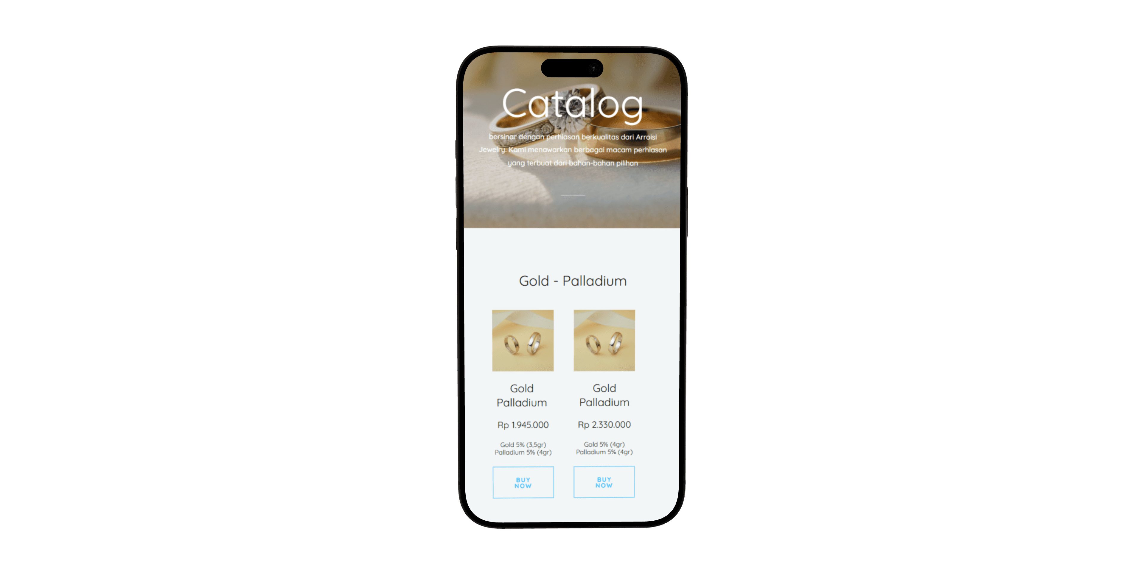
To display the ring collection professionally :
A minimal grid with high-quality product visuals.
Very concise descriptions so that the photos are the main focus.
Simple filters make it easy for visitors to find the type of ring they prefer.
Result : The collection looks premium and is easy for new users to explore.
Size Guide Page — Clear, Educational, and Easy to Follow
This section is very important for brands that sell custom rings :
Step-by-step illustrations on how to measure finger size.
International size chart (US, mm, diameter) for easy comparison.
Additional tips: the best time to measure your finger, things to avoid, etc.
Highlight : Reduces the risk of incorrect sizing and increases confidence before purchasing.
Store Locations Page — Fast Store Discovery
For brands with many offline branches :
List branches in an easy-to-scan card.
Complete details: address, operating hours, WhatsApp contact, Maps link.
Mobile-first layout for easy searching when users are on the go.
Value : Helps visitors find the nearest store in seconds.
Article Page — Informative and Trust-Building
The article page is designed to answer frequently asked questions and improve education :
The typography layout is clean and easy to read.
Articles cover topics such as material types, tips for choosing rings, and care guides.
Supporting images make the content feel professional and easy to understand.
The role of UI : Strengthening Arroisi's position as an expert brand in wedding rings.
About Page — Brand Storytelling with Emotional Touch
Explaining the brand's journey and values :
Stories about craftsmanship, fast custom service, and material value.
Visuals of the ring-making process to show quality and authenticity.
Short testimonials that provide social proof.
Outcome : The brand feels more human and credible.
Responsive UI System — Mobile-First & Performance-Oriented
All pages are designed to work optimally on mobile devices :
Simple and accessible navigation.
Images are optimized to remain sharp without slowing down loading times.
Responsive layout that remains stable across different screen sizes.
Focus : A comfortable mobile experience for the majority of users.
Design System — Consistent, Modular, and Scalable
To ensure the website is easy to maintain and develop :
A premium and consistent color palette.
Reusable components (buttons, cards, layout grids).
A typography system to maintain editorial consistency and readability.
Output : A website that is easy to expand if the brand adds products, branches, or content.
CMS Integration — Fully Editable & Scalable Website Setup
As a website with many products and guide articles, Arroisi needs a system that is easy to manage without relying on developers. Therefore, the entire website structure is implemented using WordPress CMS with a focus on efficiency and scalability.
What I Implemented
Custom Post Types for :
Rings Collection
Articles
Store Locations
Custom Fields (ACF) for :
Material details
Ring attributes (width, finishing, engraving)
Store information (address, opening hours, WhatsApp link)
Modular Content Blocks, so the team can change content with just drag-and-drop sections.
Template system to facilitate the addition of new articles or products without worrying about layout.
Why This Matters
The marketing team can add/change content at any time without calling a developer.
Productivity increases and content can be updated in minutes, not hours.
The website can be scaled up (new challenges, new collections, new campaigns) without damaging the design structure.
Impact in Daily Operation
Uploading new products → much faster.
Creating educational articles → just use ready-made templates.
Updating branch information → simply edit one CMS form.
Outcome : The website becomes a living system, not a one-time project, making it easy to maintain, easy to develop, and visually consistent.
Final Design
Visual Design




Reflection
Designing Without a Team Teaches True Ownership
Working alone from design to implementation teaches the importance of understanding the entire process: research, UI, UX, copywriting, and even CMS technicalities. This strengthens the ability to make comprehensive decisions, not just from one side of the design.
Real Users Behave Differently Than Assumptions
Observations from offline customer questions (“how much does it cost?”, “what is the difference between these materials?”, “where are your branches located?”) show that the real needs of users are often different from initial assumptions. This insight greatly influences how information is organized on the website.
Clarity Beats Aesthetic Complexity
Even when aiming for a premium look, designs that truly help users emerge from clear information structures, not excessive visual ornamentation. This reinforces the mindset that UX = communication, not decoration.
CMS Is Part of the UX
The internal team's experience in managing content is part of the overall user experience. Easy-to-use CMS integration has a significant impact on website consistency and sustainability.
Foundations Matter More Than Perfect Visuals
This project was carried out early in my career, with a lot of self-taught learning. It was from this that I gained an understanding that foundations such as content structure, grid systems, and consistency are far more important than complex visual effects.
Constraints Can Become the Best Teachers
Limited time, resources, and experience drive us to focus on practical and efficient solutions. This builds adaptive work patterns and skills that are extremely useful for future projects.
Forward-looking insights
This project demonstrates how important the role of digital designers is in areas that may seem “technical,” such as asset management and operational guideline creation. There is plenty of room to combine design thinking with direct business needs, even in backend matters such as CMS or operational workflows.
NEXT STEPS
Data-Driven Conversion Optimization
Up to this point, assumptions about the success of the redesign have largely been based on rational guesses, which is reasonable for individual projects. The next step is to test whether the UI changes actually increase inquiries and checkouts.
Plan : Set up A/B testing for CTAs, product cards, and information sequencing. Prioritize elements that are closest to conversion.
Mobile Interaction Refinement
The majority of traffic comes from mobile, but there has been no validation of whether the gestures, spacing, and hierarchy in the new version are intuitive.
Plan : conduct a short guerrilla usability test with real users (3–5 people is sufficient) to identify any remaining friction points.
More Modular CMS Integration
WordPress + custom fields are sufficient, but long-term maintainability is still fragile if the entire structure depends on one person.
Plan : Redefine modular components in the CMS so that the team can create new pages without touching the layout, just filling in the content.
Enriching Educational Content
Since custom rings are high-consideration products, purchasing decisions are strongly influenced by technical information. The website needs to evolve into a trust-building engine, not just a visual catalog.
Plan: Produce additional content (in-depth FAQ material, interactive size guides, simple price calculators).
Internal Process Automation
When traffic increases, manual workflows (DM, chat, manual invoicing) have the potential to become bottlenecks.
Plan : Integrate the flow: lead → consultation → design approval → payment → production progress tracking. Tools can range from Zapier to WooCommerce custom workflows.
Evaluate Brand Consistency
The new design is more premium, but there is a risk of mismatch with offline visuals (physical catalogs, IG feeds, photo styles). If not harmonized, the customer experience will be fragmented.
Plan : standardize minor brand guidelines: tone, colors, photography, micro-interactions.
Feature Expansion Plan
As the brand grows, the platform must be ready to accommodate new services without major overhauls.
Initial plan :
A more structured appointment system.
Branch maps with real-time material stock.
A lightweight version of the “Design Your Ring” micro-tool.