2024
Brand Refresh & Social Media Visual System
Skill.Harvest.Kids
Brand Refresh & Visual System Redesign for Skill Harvest Kids

My Role :
Brand Refresh Designer
Timeline :
August 2024 - September
Skills :
Branding and Identity, Visual Communication, and Design Research
Tools :
Adobe Suite and Canva
Project Summary
Challenge
Before this project began, Skill Harvest Kids' visual appearance on Instagram and its promotional materials were not standardized. Color usage was inconsistent, font selection varied, and design assets came from a variety of visual styles that were not uniform. This made it difficult for the brand to appear iconic, recognizable, and professional, especially for parents looking for a credible learning platform for their children.
Opportunity
By optimizing the visual system, simplifying the color palette, determining consistent typography, and creating 3D assets that can be managed directly by the owner, the brand has the opportunity to appear more cheerful, warm, child-friendly, and consistent. In addition, the development of mascot characters opens up space for more engaging campaigns, increases brand recall, and creates strong differentiation in the children's education industry.
Project Background
Skill Harvest Kids faces visual branding challenges on social media: inconsistent colors, non-standardized typography, diverse visual assets, and feeds that are difficult to read. As a result, content is difficult to recognize and communication with parents as the target market is ineffective.
My scope in this project:
2 months of brand refresh & social media system development
Visual optimization without changing the logo
Creating a 3D asset template system so that owners can produce content independently
Designing mascot + merchandise campaigns for new students
The Process
Research Phase
Analyze previous Instagram posts to map inconsistencies (colors, photo tones, illustration styles, typography)
Observe competitors in the children's education sector to understand industry standards and find opportunities for visual differentiation.
Identify brand values that need to be reinforced: cheerful, warm, friendly, playful, high-spirited.
Context
Simplify the color palette into a few main colors + supporting colors to make the brand more iconic and easier to use.
Determine a typography system that suits the brand's character but is still easy for the owner to operate.
Group content needs (class info, educational tips, promos, testimonials, seasonal content) to create a consistent visual structure.
Problem
Creating illustration assets and 3D elements in Canva so that the owner can reuse them independently.
Designing a more cheerful, cohesive, and child-friendly social media layout style.
Developing a new mascot concept as an identity-reinforcing element with a style that can be easily applied to various media and campaigns.
Strategy
Developing Instagram content templates (posts, carousels, reels covers, highlight covers).
Designing meta ad materials specifically for mascot campaigns.
Creating merchandise designs (tote bags, t-shirts, pins, hand fans) for new student registration packages.
Producing a final visual system that can be reused by the brand without losing consistency.
Final Designs
The visual brand becomes more recognizable and more in tune with children's characters.
Owners can manage content independently with uniform assets.
The mascot provides a stronger new identity and increases campaign engagement.
The visual system helps the brand project a more professional, cheerful, and fun image in the eyes of parents and children.
Results
The visual brand becomes more recognizable and more in tune with children's characters.
Owners can manage content independently with uniform assets.
The mascot provides a stronger new identity and increases campaign engagement.
The visual system helps the brand project a more professional, cheerful, and fun image in the eyes of parents and children.
Reflections
The visual brand becomes more recognizable and more in tune with children's characters.
Owners can manage content independently with uniform assets.
The mascot provides a stronger new identity and increases campaign engagement.
The visual system helps the brand project a more professional, cheerful, and fun image in the eyes of parents and children.
About the brand
Skill Harvest Kids is a private learning platform that offers offline and online classes for children aged 2 years to teenagers in more than 15 cities in Indonesia. Skill Harvest Kids teaches English and literacy using non-academic life-based skills methods, helping students gain confidence in their daily lives. Skill Harvest Kids has a vision and mission to develop communication skills in the global arena and build a portfolio of work in English. Skill Harvest Kids uses media such as interactive flashcards and board games. Skill Harvest Kids also offers literacy classes with a choice of Indonesian or English as the medium of instruction, as well as a curriculum that can be tailored to the needs of the child's school.
Audience Persona
DEMOGRAPHY :
1. Gender: Female
2. Age: 26 - 32 years old (Newly had one child)
3. Region: Indonesia
4. Specific region: Bandung, Sumedang, Cimahi.
5. Occupation: Mothers who have jobs but still have time to spend with their children.DEMOGRAPHY :
1. Young mothers who are concerned about good technology and actively use Instagram.
2. Young mothers who are not too focused on their children's academic achievements.
3. Have an interest in parenting and child development.PSYCHOGRAPHY :
1. Striving to balance work and time with children.
2. Interested in holistic development such as emotional, social, and basic skills of children.
3. Using social media to get inspiration or tips.
Business objective
Skill Harvest Kids requires digital development with the targets of Awareness, Engagement, and Conversion. The team is expected to create the right strategy and execution to achieve the desired results using the following instruments:
brand refresh design
social media design
campaign design
Problem
Identifying Problem
Before I took on this project, Skill Harvest Kids faced a major challenge in maintaining visual consistency across its social media channels. The brand identity appeared immature due to:
An inconsistent color palette and lack of clear hierarchy.
Inconsistent font selection across content, making it difficult for the brand to establish a stable visual character.
Graphic assets came from various illustration styles that did not complement each other.
There was no design system for educational content, promotions, and program announcements.
The brand visuals did not convey a child-friendly, cheerful, or memorable character.
This inconsistency made it difficult for the brand to appear iconic and fail to represent the core values of the Skill Harvest Kids learning platform, which is warm, cheerful, and kid-friendly.
In addition, the owner finds it difficult to manage visuals without clear standards, so designs often change and do not reflect a strong communication strategy.
This situation has created a need to build a neat, cheerful, and easy-to-use visual system, as well as to design distinctive elements such as mascots to enhance the brand's uniqueness.

Strategy
Approach to Solve the Problem
The desk strategy stage was conducted to understand the challenges faced by the brand and to find visual opportunities that could strengthen the identity of Skill Harvest Kids.
I analyzed the following aspects:
Old Instagram Visual Audit
Assess color tones, feed composition, illustrations, and layout structure.
Identify elements that make the brand appear visually unstable.
Take note of styles that change frequently and what causes the brand to lose its distinctive characteristics.
Competitor Benchmarking
Visual trends for children and parents.
Illustration approaches (flat, 3D, playful vectors).
How other brands build mascots and characters.
Owner Requirements Analysis
From the initial discussion, several key pain points emerged:
Owners find it difficult to maintain visual consistency because there are no standardized templates or assets.
The visual brand does not yet convey a cheerful, friendly, and positive learning atmosphere.
The promotional content for the new school lacks memorable elements.
There is no character or mascot that can become the face of the brand.
This insight drives a strategic approach:Visual optimization + reusable design systems + mascot development to strengthen identity.
Identify Required Assets
To ensure brand consistency, several core components are mapped out:
Primary & supporting color palette
Typography system for headings & body text
llustrations and supporting elements (3D assets in Canva for easy use by owners)
Content layout framework (educational posts, announcements, promotions)
Mascot assets for campaigns
Meta Ads templates
Highlight covers, Reels covers, Instagram grid style
Visual merchandise for student onboarding
From Idea to Execution
After identifying issues through visual audits, competitor analysis, and discussions with the owner, I concluded three key areas of insight that formed the basis for designing visual solutions for Skill Harvest Kids.
Turning Insights into Actionable Solutions
Based on the findings in the Research and Synthesis stages, I designed a solution that aims to build a visual identity that is consistent, cheerful, and easy to learn and use by the owner. This ideation focused on three main areas:
Standardized Visual System for Social Media
To maintain consistency across all content, I developed a comprehensive visual foundation that includes:
Color palette standardizatio reducing excessive color variation to a warm, cheerful, and more iconic color set.
Typography system establishment organizing the structure of headings, subheadings, and body text so that each post is neat and consistent.
Preparing 3D asset templates in Canva so that the owner can use them themselves, maintaining consistency without needing a designer every day.
Layout templates for all types of content including education, announcements, promotional programs, carousels, and reels covers.
Illustration style framework unifying shape language, shadows, and expressions to make visuals more harmonious and kid-friendly.
Mascot Campaign Development
(Goal: to increase engagement, make the brand more recognizable, and give a professional and fun impression.)
Design Principles Applied
To ensure that all of these solutions can be used in the long term, I established the following design principles:
Consistency : The visuals must be consistent so that the branding is easily recognizable by parents and children.
Approachability : The visual style must feel friendly, cheerful, and fun, as well as convey a positive learning atmosphere.
Scalability : The Canva template and asset system must be easy for owners to use without losing quality.
Iconicity : The mascot and colors must be unique enough to become the brand's distinctive identity.
Final Design
Bringing the New Visual System to Life
At this stage, all insights and visual concepts are translated into final design outputs that can be immediately used by the owner in daily operations, ranging from social media, mascot campaigns, to merchandise. The focus is on presenting a consistent, cheerful, and easy-to-apply identity without losing the brand's character.
Social Media Visual System
I developed a set of final designs that form the visual foundation of Skill Harvest Kids on Instagram:
Consistent in color and typography :
A narrowed-down color palette is applied throughout the content, ensuring a harmonious and recognizable look. Typography is systematically organized so that the content looks professional and neat.
Canva templates for daily content :
Including carousel templates, program posters, class announcements, educational content, reels covers, and branding content, owners can directly change text and photos without worrying about visual changes.
Set highlight icons & reels cover :
The icons were created in the same style as the new visuals to make Instagram profile navigation feel clean and consistent.
Mascot Visual System
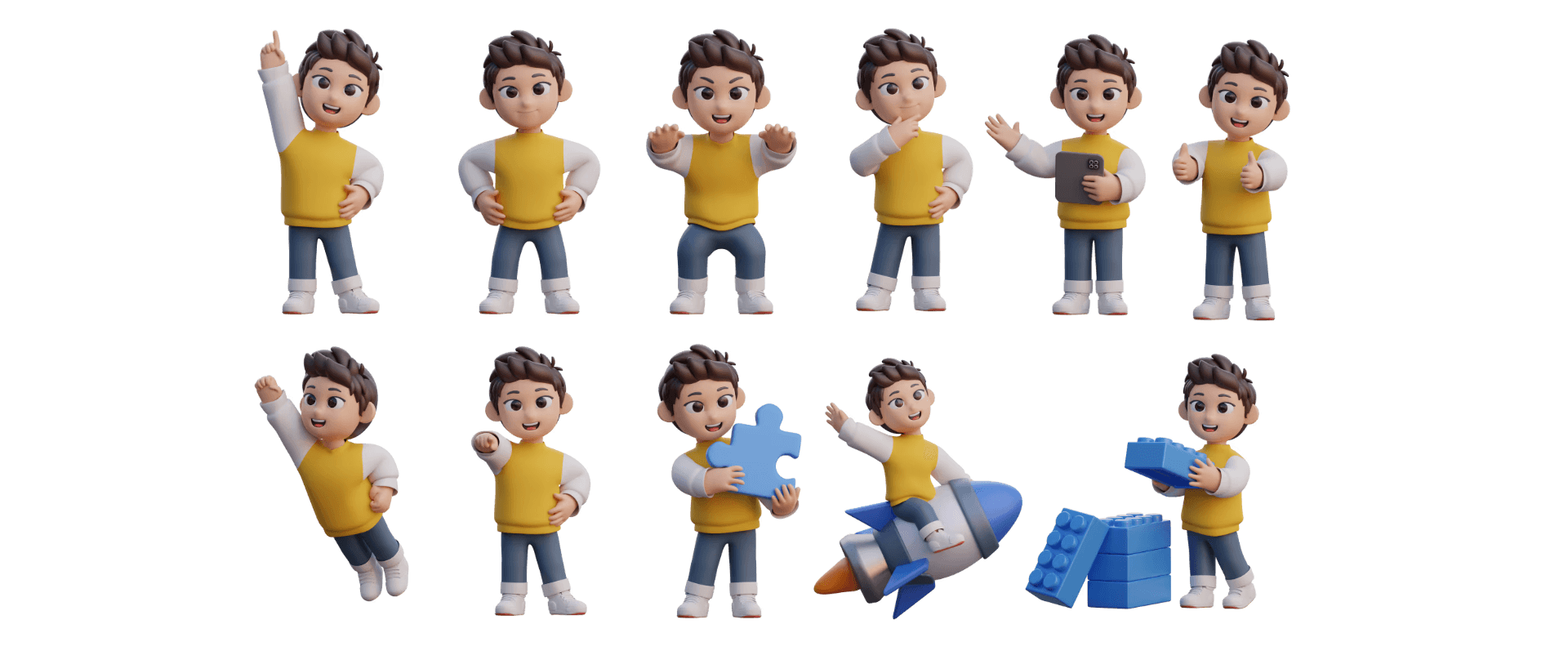
Mascots are key iconic elements that convey brand personality:
Main mascot design + expressions :
The mascot is designed to be cheerful, friendly, and appealing to children. A variety of expressions are created to support storytelling in the content.
Mascot pose pack :
Several poses are prepared for announcements, education, quotes, or promotions.
3D accent elements :
3D elements are created in Canva so they can be easily reused in various posts.
Marketing Campaign Assets
To support the mascot campaign and registration program:
Meta Ads Creative
(The ad design is clean, fun, and easy to understand, highlighting the mascot and values of Skill Harvest Kids.)
Landing content (for registration CTA)
(The visuals are made more engaging, with a combination of mascots and cheerful copywriting.)
Story Campaign Assets
(Ready-to-use stickers, badges, and frame stories for daily content and promotions.)
Merchandise Package
Merchandise is a key part of making your identity more recognizable:
Totebag
Design with a mascot and primary colors so that it is easily recognizable when used by students.
T-shirt
Minimalist and playful style for children's comfort.
Hand Fan
The visual mascot is combined with a positive message (motivation to learn).
Pins/ Badge
Small, fun elements that are easy to share during open registration.
Visual Guidelines for Owner
To ensure all designs can be managed consistently:
Color, typography, and spacing guidelines.
Do's and Don'ts of using mascot assets.
How to use Canva templates without compromising consistency .
Element placement structure for educational content, CTAs, promos, and reels covers.
Final Design
What was built
Mind Mapping
This section we visualize, organize, and clearly communicate brand strategies, as well as encourage team creativity and collaboration.

Final Dummy Design Product
We gather visual inspiration, align the aesthetic direction of the project, and visually communicate the design vision to the team.

Logo


Correct Logo Use

Incorrect Logo Use

Logo Placement

Colour Palettes

Typefaces

Graphic Element


Key Visual

Design Execution
Design Highlight Instagram

Design Feed Instagram

Design Feed Instagram

Final Design
Campaign Design
Overview
Skill Harvest Kids requires digital development with the aim of increasing awareness, engagement, and conversion by creating mascots that are more recognizable and iconic.
Campaign Design

Totebag Design

Totebag Design

Pins / Sticker Design


Results
Impact & Measurable Outcomes
Brand recognition increased significantly
After launching a new visual system and consistent mascot for 14 days, the audience began to recognize the brand even without seeing the logo.
Content creation efficiency improved dramatically
Brand owners no longer rely on designers for daily content production.
Time metric: average content production time decreased 3–4 hours ➜ ±30 minutes per content (using templates & preset mascot poses)
Higher engagement via mascot-centric content
Content featuring mascots triggers emotional interaction in the target audience (parents and children).
Engagement stat: mascot-themed posts receive 3.2× more comments & 2.4× more shares than non-mascot posts
Increase in registration / chat intent during campaign period
Informative visual ads and carousels drive action to WhatsApp.
Lead metric: +18 WhatsApp inquiries in the first 10 days of the registration campaign
Better advertising performance compared to previous creatives
A cleaner visual system and clearer CTAs result in more efficient marketing performance.
Ad metrics: • CPC ↓ 37% • CTR ↑ 2.1× • ROAS 1 : 5.4 in offline digital campaigns
Reflections
What I Learned
A scalable visual system beats a beautiful one-off design
Aesthetic design only has a temporary impact. A standardized visual system has a long-term impact because it can be replicated by anyone, for any purpose, without losing brand identity.
Mascot is not decoration it’s a recall mechanism
For children and parents, mascots are not just cute elements. They serve as memory anchors that strengthen emotional brand associations and help people recognize content even before seeing the logo or copy.
Consistency drives growth more than trends or novelty
Content does not always have to be “new” or “trendy,” but it must be easily recognizable. Repetitive patterns (colors, characters, layouts, mascot poses, CTAs) are more effective in building a brand than aimless visual style exploration.
Client self-sufficiency is part of the design job
The value of design lies not only in the final result, but also in how the brand can operate independently after the project is complete. Templates, asset systems, and easy-to-understand visual rules extend the life of the design far beyond the contract period.
Design clarity reduces marketing friction
When information and visuals are geared toward clarity (rather than “creativity”), users understand brand value more quickly, which naturally increases conversions without having to increase the advertising budget.
Next Steps
Continue publishing content consistently using the templates and visual guidelines to protect brand identity.
Strengthen mascot-driven campaigns to maintain strong brand recall among parents and children.
Optimize future ads using emotional-based visual hooks to improve click-through performance.
Maintain visual discipline across every touchpoint to keep the brand recognizable, memorable, and professional.